


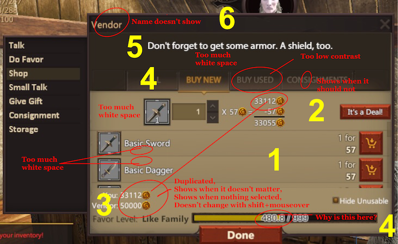
This isn't meant as a rant. The new shop UI is pretty, has some nice features and potential for some good layout. The sections are numbered in the image. But the old shop UI was weirdly efficient, so you have shoes to live up to! Many of these will have been mentioned elsewhere, I just wanted to put all the things I thought about in one place. Also, to give a better visual idea of what I was referring to.
First general bug is that the fonts in this window do not change when you change other NPC and UI fonts. The icons and fonts probably should follow the same rules as the other ones in the game; if they're 50% bigger than my inventory icons, that's okay, but right now on my screen they're 100% bigger.
1) This is where the meat is; the items we want to buy. This section is really given the short shift in this layout: It does what it should, expanding when the window expands, but is very crowded by the other frames.
. a) The buy icon is nice and big and regular. I like it.
. b) The spacing is too tall. It's wider even than double-spaced type. This should be reduced to at most double-spaced.
. c) The price is listed in a small font. It's bold, that's great, but the price is what we're looking for.
. d) '1 for' Since most items are singular, this is really unnecessary unless it's part of the stack. It shouldn't take up its own line, forcing a double double white space, should it?
.. -) Perhaps it could be appended to the prices, like '57 for 5' and placed on a single line.
.. -) Or maybe place the batch number in the icon, like you'd see in your inventory.
. e) Bug: When you hold shift, the prices and UI doesn't change or respond. (old UI function)
. f) Bug: When you buy something, the entire list is resorted. That makes finding where you were a pain. (old UI function)
2) Calculator.
. a) This section is unnecessary much of the time. Really we only need it to show when we've selected an item from the list, when we've pressed a modifier key to buy a larger or smaller amount of a moused over item. The old UI did this well.
. b) Bug: This section displays errors when in the consignment screen as if you'd buy the whole stack.
. c) This section doesn't change when you press shift to buy the entire stack.
. d) This section has unnecessary whitespace at the sides that it could be used more efficiently.
. e) The buy icon is weirdly smaller than for section 1.
. f) It duplicates the information in section 3. If it displays my cash on hand, that's not needed in section 3. If section 3 shows vendor allowance, I don't need it in section 2.
3) The tail.
. a) When I'm selling, I usually don't need to know my cash on hand.
. b) When I'm buying, I really don't need to know the vendor's cash on hand.
. c) This area really could say something better like 'how much more this vendor will buy from you' or something more detailed than 'vendor'.
. d) 'Unusuable'. If we're going to have ways to sort, this is a good place to put it. But what about having an item level range or a drop-down to select the skills we're interested in seeing listed? I really don't care that I can use level 15 Fire Gear when I'm looking for high level Unarmed gear. Level 15 gear is just as unusable in that situation as stuff I can't wear.
4) Tabs.
. a) The tabs have inconsistent widths.
. b) The labels are very low contrast. The grey is especially hard to see and pick out.
. c) The consignment tab shows regardless of whether there are anything in it or whether the vendor even takes consignments.
. d) The spacing is again, more than double spaced.
5) Tag line.
. a) There is a strange amount of excess whitespace here.
. b) It's not centered the same way the tabs are.
. c) It's not controlled by NPC font size.
. d) It's in the biggest font, but is the least important thing displayed.
6) Window title.
. a) It doesn't say the NPC's name. I really wish it said that instead of 'vendor'. I know it's the vendor window. (Actually, most of the window titles are superfluous.)
Welcome to Project: Gorgon!
Project: Gorgon is a 3D fantasy MMORPG (massively-multiplayer online role-playing game) that features an immersive experience that allows the player to forge their own path through exploration and discovery. We won't be guiding you through a world on rails, and as a result there are many hidden secrets awaiting discovery. Project: Gorgon also features an ambitious skill based leveling system that bucks the current trend of pre-determined classes, thus allowing the player to combine skills in order to create a truly unique playing experience.
The Project: Gorgon development team is led by industry veteran Eric Heimburg. Eric has over a decade of experience working as a Senior and Lead Engineer, Developer, Designer and Producer on successful games such as Asherons Call 1 and 2, Star Trek Online and other successful Massively Multiplayer Online Games.
User Tag List
Results 1 to 9 of 9
Thread: New Shop UI
Threaded View
-
12-06-2017, 02:08 AM #1Senior Member

- Join Date
- Dec 2016
- Location
- Santa Cruz, CA
- Posts
- 861
- Mentioned
- 24 Post(s)
- Tagged
- 0 Thread(s)
New Shop UI

 Reply With Quote